 We did Photoshop for Aesthetics today. It was so fun (why do I keep repeating this line everytime I find something interesting?!).
Mr. Wong split the class into 2 halves, so my half went to the Shaw Lab first. Many of the computers were screwed. We weren't allowed to use the Macs so we got stuck with the PCs, though PCs are not bad, but they still lagged a lot.
.
Anyway, he made us look for Q:/ where he stored all our 'artworks'. Only about 3-7 computers have that drive, and I so happened to be one of the many unlucky ones that ended up with a computer lacking that essential component.
.
I attempted to copy the whole file off Mel's computer but it failed terribly. Even copying 7 images took over 5 minutes. Mel gave up on me because the computer started taking lightyears to load one image so we took my thumbdrive out of the computer.
.
Since my computer didn't have a Q:/ and the pictures that were copied so far into my thumbdrive sucked big time (sorry for those who did them...) I tuned out of Mr. Wong's lesson and played around with the many brush styles I found in the system.
.
The first piece I did with the brushes was called 'FLYaway Dreams'. Black toned coloured butterflies and roses found on cliched advertisements for women's perfume. The following two were also in grey-scale but they had different designs -- their focus and background composition were different and I liked them a lot.
.
I only had time to do three because it was my first time on Photoshop and it was a little hard trying to get the hang of it. When we returned to the Art Room to 'complete' our posters, I did more. Six more, in fact.
.
The settings for colour when I first used the computer I snagged was pink, pale pink, pastel pink, whatever pink, so I was pretty surprised (serious understatement) when it turned out quite nice (another grave understatement) with a mix of rounded and maple leaves. I called it 'SIMPLICITY'.
.
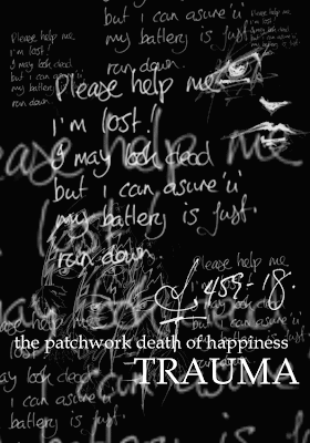
'REACH out for the STARS' came after that, then 'CHANGE', next was 'ELEGANCE' which was basically the same as 'CHANGE' except for the wording. The last two were 'the WIND' and 'TRAUMA' (which is featured above). I had white backgrounds for all of them so I thought 'TRAUMA' was pretty unique and special. It was the only one with text for a background.
.
Sorry the layout is pretty screwed. Everytime I add an image it always takes away all the carriage return (what the hell is that? I found it on answers.com) I put in place so I gotta add the '.' or it will be so taxing on your eyes to read.